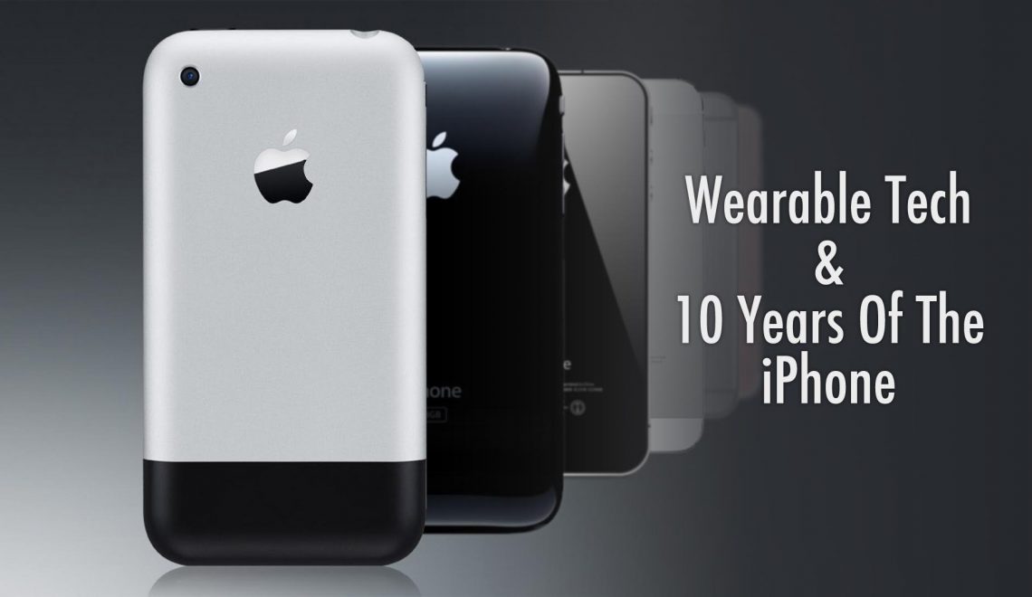
After years of speculation, Apple today announced the Apple Watch. While the wearable device will not ship until early 2015, the company likely wanted to get ahead of any potential product leaks and disrupt holiday sales of existing smart watches on the market. Marking a first for smart watches, the device will ship in multiple materials, finishes, and sizes with a large selection of interchangeable bands. Earlier we discussed how important individuality is for a fashion piece (which a watch is) to be successful, clearly Apple understands that. While Apple Watch’s varied product matrix is sure to make consumers happy, the general consensus is that the design could have been more unique. While competitors are releasing round and curved displays, Apple opted for a basic rectangular screen. Interestingly, the look is very reminiscent of the original iPhone. Hopefully the usability of the device makes up for any design shortcomings.
 It appears Apple has taken great care to provide a unique, intuitive, and customizable interface. The crown on the watch (the rotating nob on the side) replaces both the home button and the pinch-to-zoom movement we have all grown accustomed to, avoiding the issue of your fingers covering the entire screen. Apple is also introducing a new touch concept, the watch is able to detect the difference between a tap and a hard press. The device is highly customizable, with every watch face providing various options for color or design and what information is presented. Also customizable are GoogleNow-esque cards that are a swipe away from the watch face. When you want to access your apps, pressing in on the crown takes you to a home page filled with circular app icons.
One of the discussion points about wearable tech up to this point is whether it offers an intimate experience. Wearable technology needs to be about the user, not about everyone around them knowing their business. In an effort to make the smart watch more intimate, Apple Watch introduces two concepts. First is a custom designed vibrating motor, which they call the Taptic Engine. The Taptic Engine is designed to operate silently and only be felt by the wearer. The user also doesn’t need to be looking at their watch every time it vibrates because unlike current Android Wear devices, Apple is promising fine control of which notifications are passed on to the watch. The second concept introduced by Apple are short, temporary, and discrete messages that can be sent between users. These messages can either be a series of taps, a drawing, an animation, or even the sender’s heartbeat. The idea is to make the experience feel more personal.
With a starting price of $349, Apple Watch is one of the most expensive smart watches on the market. We are a long ways away from the launch of the Apple Watch and there are a lot of intriguing Android Wear devices hitting the market before the end of the year. It will be interesting to see how Apple’s device and user interface compare to the competition when it does finally go on sale in 2015.


